The Colors Behind Bollywood's Stories
Color in Bollywood cinema is rarely just ornament. Why Bollywood's directors use color palettes to tell stories comes down to visual grammar: a recurring red can frame desire or danger, while cool blue may suggest distance, memory, or silence. The palette becomes a quiet narrator, guiding viewers through changes that dialogue alone cannot carry.
Each filmmaker handles that grammar differently. Sanjay Leela Bhansali builds lavish worlds in jewel-like reds, golds, and blues; Anurag Kashyap often favours dirty greens, bleached earth, and abrupt neon; Gauri Shinde mixes confectionery pastels with sharper comic notes. Their choices feel distinct because color is tied to character, setting, costume, and the emotional temperature of each scene.
The strategy suits a cinema built on tonal shifts. A family drama can slide from warm domestic comfort into a cold, shadowed argument, while a song sequence may temporarily replace muted realism with saturated fantasy. Costumes, interiors, lighting, and cinematography therefore work as one coordinated storytelling system rather than separate departments.
For Australian viewers, this visual language is increasingly easy to encounter at home through Netflix, Prime Video, and Disney+ Hotstar, depending on the title and licensing. Sydney and Melbourne audiences also encounter Bollywood at events such as the Sydney Indian Film Festival and Indian Film Festival of Melbourne, within cities home to large Indian communities. The familiar Australian ritual of a relaxed cinema outing, often paired with an afternoon or early-evening screening, adds another lens: these films are designed for communal viewing as much as for a television screen.
Color as a second script
Directors can establish a visual rule before a character speaks. A bride may remain framed in red while the world around her drains toward grey, making her desire visible without exposition. Repeated hues also create motifs: saffron in a procession, green in a political meeting, or blue around a character who feels trapped can connect separate scenes and gradually acquire meaning.
Color can also structure time. Warm, softened hues may make a recollection feel affectionate, whereas a present-day scene rendered in harder contrast signals distance between memory and reality. When the same shade returns in a different context, viewers may read it as a pattern, even before they consciously understand the plot.
Building emotion through contrast
The most immediate emotional tool is contrast. Saturation beside dusty neutrals can turn a fantasy number into an interruption of ordinary life; a flash of bright red against a blue-green room can suggest danger before anyone acts. In Devdas, romantic excess and emotional excess occupy the same visual field, so the palette amplifies the film’s melodrama rather than merely decorating it.
Contrast does not carry one universal meaning. Red may signal romance, aggression, sacrifice, or festivity depending on costume, light, and cultural setting. Kashyap’s films often make familiar symbols look unstable: neon or a vivid hue inside a grim environment can expose hypocrisy, urban anxiety, or violence. The useful question is what the film has trained us to notice through repetition.
Distinct palettes, different worlds
Repeated palette choices can become part of a director’s signature, but the strongest examples remain responsive to each film. The following patterns show how chromatic storytelling can direct emotion, period texture, and genre.
| Director | Recurring palette | Narrative purpose | Example |
|---|---|---|---|
| Sanjay Leela Bhansali | Saturated red, gold, jewel tones | Heightens romance, ambition, and spectacle | Bajirao Mastani |
| Anurag Kashyap | Muted earth, dirty green, sharp neon | Suggests alienation and moral instability | Gulaal |
| Ashutosh Gowariker | Ochre, dusty pastels, sunlit neutrals | Gives social and historical settings tactile weight | Lagaan |
| Gauri Shinde | Soft pink, cream, bright accents | Maps family friction, urban anxiety, and comic release | English Vinglish |
| Ayan Mukerji | Blue, turquoise, warm yellow | Supports romance, nostalgia, and escapism | Yeh Jawaani Hai Deewani |
These are tendencies, not permanent brands. Bhansali’s reds and golds intensify courtly conflict in Bajirao Mastani, while the softer interiors of Gangubai Kathiawadi create space for social observation. A director may also deliberately break a familiar palette when a character’s life changes, making the rupture as meaningful as the rule.
Music, dance and dramatic shifts
Song sequences are palette laboratories. A director can mute the surrounding world and then flood a dream, procession, or romance with coordinated color, turning choreography into emotional architecture. In a film such as Devdas, formal song settings gather reds, golds, and theatrical light around the central performance, while dialogue scenes feel comparatively shadowed. The contrast lets excess become part of the narrative.
Indian cinema’s use of song and spectacle makes this approach especially flexible, yet it also demands restraint. A crowded wedding, a devotional sequence, and a political rally each need visual separation from surrounding scenes. Warm light, distinctive costumes, and carefully chosen set colors can identify who belongs to which emotional register without slowing the film’s momentum.
Streaming and the global viewer
Digital distribution has made the palette harder to pin down because audiences may move between a calibrated home screen and a bright suburban cinema. Streaming also exposes viewers to Indian films from different regions and decades, making comparison natural: does this director preserve a recognizable chromatic signature when the genre changes? For Australian viewers watching late at home after work, subtler shifts in saturation may matter as much as a dramatic change of location.
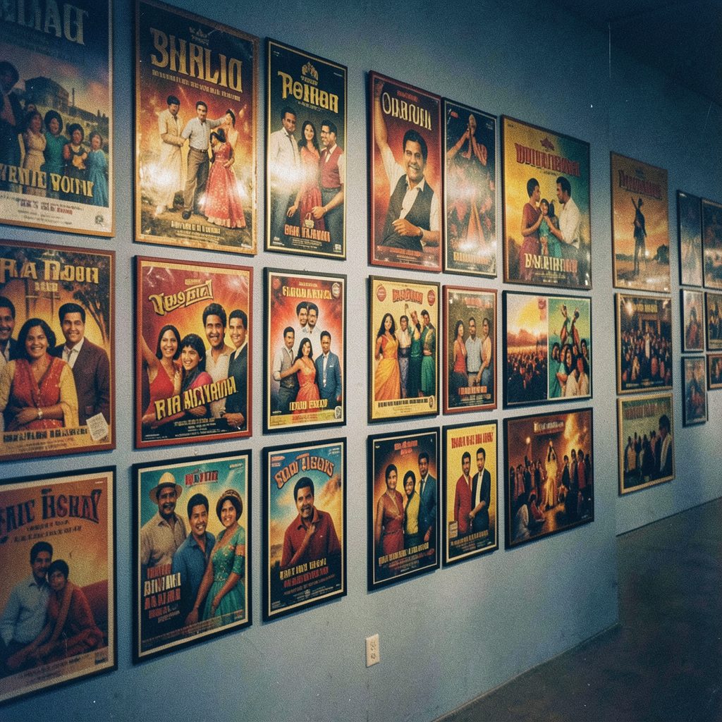
International viewers may bring different associations with color, so the images need context as well as beauty. A poster or trailer can compress a film into one attractive hue, but a feature can use that hue ironically, gradually, or against expectation. Directors who master this distinction can make a commercial film visually distinctive without assuming that every audience begins with the same cultural vocabulary.
A practical method for reading color
Color analysis becomes more precise when it is treated as a sequence of choices. The following checks help viewers identify what the palette is doing without reducing the film to whether a scene looks attractive.
- Track the dominant hues and note whether they belong to a character, a location, or a narrative mode.
- Mark the exact moment saturation, temperature, or contrast changes, because the timing can signal a tonal rupture.
- Follow one color across scenes and test whether its meaning stays fixed or is deliberately reversed.
- Compare song sequences with dialogue scenes to see when fantasy replaces realism or supports it.
- Separate the film’s palette from its poster and trailer, which may simplify the visual language for promotion.
- Read every hue in context, using repetition, costume, and setting instead of assuming a universal color dictionary.
Together, these checks reveal chromatic storytelling as a form of mise-en-scène: meaning distributed through the combined work of photography, design, wardrobe, and light. They also keep interpretation grounded in evidence rather than vague statements that a film feels colorful.
Color as Bollywood’s cultural memory
Color palettes preserve and reshape the cultural memory of Hindi cinema. They can turn a wedding into a blaze of red and gold, make a village road feel like a painting, or place a modern relationship inside the visual debris of an older generation’s expectations. When these choices are coordinated, the screen carries social history as well as personal emotion.
Directors also use color to make genre legible in a crowded market: family warmth, political menace, comic release, or romantic fantasy can be recognized at a glance. For audiences in Sydney, Melbourne, and other Australian cities, that visual fluency remains valuable even when a plot is unfamiliar. The most useful viewing habit is simple: track recurring colors, identify the moment they shift, and let that pattern reveal the film’s emotional logic.