The art of the Bollywood film poster
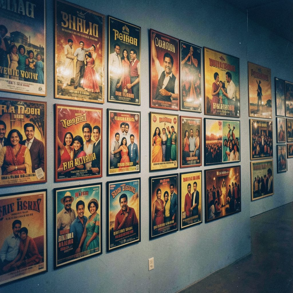
The art of the Bollywood film poster is cinema distilled into a flat image. It must communicate genre, star appeal, mood and cultural setting within seconds, often using little more than a face, a colour, a title and a striking symbol. These images have also become collectible objects, circulating as prints, magazine artwork and wallpapers long after a film leaves cinemas.
For Australian viewers, Bollywood posters often arrive through subtitled theatrical releases, streaming promotions and festival programmes. Events such as the Indian Film Festival of Melbourne, along with South Asian cinema selections at the Sydney Film Festival, expose local audiences to the visual history of Hindi movies. Many Indian Australian communities in Sydney and Melbourne also encounter new releases as part of family outings, festival gatherings and online conversations.
A successful poster does more than advertise a release. It establishes an emotional contract with the audience, suggesting what the story might feel like before the trailer appears. Its effectiveness comes from a precise balance of visual drama, cultural detail and commercial clarity.
From hand-painted icons to digital campaign worlds
Early Bollywood poster design was rooted in hand-painted artwork and lithographic printing. Artists exaggerated expressions, stacked characters and filled the composition with painted scenery. The rough edges and visible brushwork gave each poster a singular presence. Digital tools later enabled photomontage, sophisticated lighting and rapid revisions, while social media demanded images that could work as small thumbnails.
| Feature | Classic hand-painted poster | Contemporary campaign design |
|---|---|---|
| Image-making | Individual illustration and painted character portraits | Photography, digital compositing and 3D elements |
| Typography | Hand-lettered title treatments integrated into the artwork | Flexible digital type, animation and campaign variations |
| Composition | Dense, layered scenes with minimal empty space | Strong focal hierarchy and deliberate negative space |
| Colour | Bold, sometimes unconventional combinations | Mood-led palettes graded for screens and outdoor printing |
| Distribution | Posters and lobby cards in cinemas | Posters, streaming banners, social posts and merchandise |
Contemporary design frequently combines both traditions. A digitally composited star portrait may be surrounded by hand-painted motifs, while traditional illustrated backgrounds can be animated online. Physical posters have retained their importance because fans value the sense of occasion they create in a cinema foyer or at home.
Faces, type and the promise of a story
The human face remains a Bollywood poster’s strongest navigational device. Large eyes, expressive gestures and carefully chosen costumes can communicate a character’s personality instantly. Star positioning also reflects commercial priorities: the hero may dominate the image, or an ensemble may be arranged around the conflict at the heart of the story.
Typography works in parallel with the image. Devanagari lettering can provide rhythm and personality, while an English title helps non-Hindi-speaking viewers recognise the film. The size, placement and shape of each title establish hierarchy, but designers must avoid making the typography so decorative that the name becomes unreadable. A title song, remake credit or character name may also carry cultural meaning that changes the poster’s tone.
The central challenge is deciding what deserves emphasis. A romance may rely on the chemistry between its leads, a thriller may use an ominous environment, and an ensemble comedy may need every principal character to remain visible. The poster’s hierarchy becomes a condensed version of the film’s marketing strategy and narrative priorities.
Colour, symbols and cinematic atmosphere
Colour gives a poster its immediate emotional temperature. Saturated pinks and oranges can suggest romance, family drama or spectacle, while cold blues and deep blacks often accompany thrillers and mysteries. Designers also draw on genre conventions familiar to international audiences: weapons for action, masks for mystery, instruments for musical drama and ornate settings for historical romance.
Symbols require greater care because their meaning depends on context. A lotus, a trident, a royal palace or a modern city skyline can locate a story in a particular cultural or regional setting. Such imagery risks becoming decorative shorthand when it is not connected to the narrative. Strong posters use these elements as narrative clues rather than isolated references to “Indian cinema”.
Scale and negative space determine whether the artwork feels intimate or epic. Close-up faces invite a personal response, whereas miniature figures and sweeping architecture can make the world of the film feel larger. Every composition should also survive reduction: a poster viewed on a phone, a narrow digital banner and a large hoarding require different levels of detail but the same unmistakable focal idea.
Designing for attention in Australian markets
Australian distribution adds practical considerations for posters used on local releases. Most viewers encounter Hindi films with English subtitles, so an English title, readable tagline and clear character hierarchy often matter more than a dense block of Hindi credits. Campaign artwork must also work for streaming thumbnails and social posts, where the image competes with dozens of other recommendations on the same screen.
Outdoor advertising in Melbourne and Sydney provides a demanding environment. Posters appear on bus shelters, railway platforms and large entertainment-district hoardings, often surrounded by competing messages. From a distance, the title and principal face must register first. Local outdoor-advertising formats can crop artwork, while rules governing dimensions and placement make testing essential before a campaign reaches production.
The Indian Australian audience brings additional context. Communities centred around areas such as Cabramatta in Sydney and Richmond in Melbourne often discuss new releases across family groups and social media. Diwali can also become a natural period for shared cinema outings, giving familiar film imagery a role in celebrations and home decoration. Posters that respect regional identities while remaining clear to a broader Australian audience therefore need cultural specificity without visual exclusion.
Several design choices can strengthen a Bollywood campaign across these markets:
- Begin with one clear narrative idea, then remove any visual element that does not support it.
- Give the title, principal face and central symbol a deliberate order of prominence.
- Connect colour and cultural motifs to the film’s tone rather than using them as generic decoration.
- Test artwork as a phone thumbnail, a small print and a large outdoor advertisement.
- Prepare subtitle, bilingual and campaign variations while preserving the same visual identity.
Adaptation should never make the poster feel detached from the original Hindi-language audience. A local version can improve legibility and clarify the film’s appeal, yet it should retain the colours, lettering and cultural texture that make the design recognisable.
The image that remains after the credits
Bollywood posters often outlive the release cycle surrounding them. Fans revisit them after years, displaying them as wallpapers, framing limited-edition prints or using them to remember the mood of a favourite film. Their appeal lies partly in the tension between a carefully controlled commercial image and the visible personality of the designer who made it.
That tension continues to shape the medium. Photorealistic faces can attract attention, but illustration can express exaggeration, romance and theatrical energy that photography cannot. The enduring skill is synthesis: combining stars, symbols, type, colour and setting into one image that feels immediate without explaining too much.
The most memorable Bollywood poster does more than announce a film. It creates an anticipation, preserves the atmosphere of a story and gives the audience an image powerful enough to remember before the first frame is shown.