How Bollywood’s colour palettes shifted from vibrant to muted and back
Bollywood has long been associated with visual abundance: jewel-toned costumes, sunlit song sequences, richly painted interiors and posters designed to command attention from a distance. Yet Hindi cinema has repeatedly changed its colour language, moving between saturated spectacle, dusty realism, cool urban minimalism and carefully controlled bursts of colour.
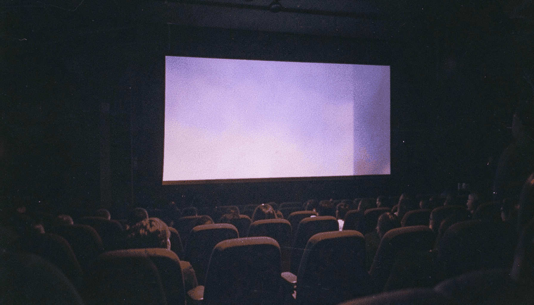
This evolution reflects more than fashion. Film stocks, digital cameras, streaming platforms, production design, audience taste and social mood have all influenced how Hindi films look. For Australian viewers watching in Sydney, Melbourne, Brisbane or smaller regional cinemas, the difference can be especially clear on a large screen, where a faded room, neon street or crimson costume becomes part of the story’s emotional architecture.
From saturated spectacle to emotional restraint
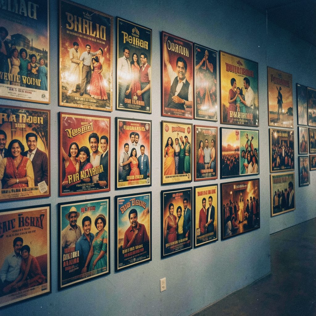
Classic Bollywood often used colour as an immediate promise of pleasure. Red saris suggested romance or danger, yellow costumes brought warmth to outdoor songs, and turquoise, magenta and emerald helped stars stand out against elaborate sets. Technicolor-inspired styling was strengthened by Indian textiles, festival imagery and the commercial importance of music sequences.
The shift towards muted palettes began gradually. Filmmakers working with intimate dramas, crime stories and middle-class realism favoured browns, greys, olive greens and soft natural light. These tones made locations feel lived-in rather than decorated. A cramped apartment, crowded railway platform or rain-darkened street could communicate financial pressure and emotional fatigue before a character spoke.
Muted colour did not mean visual emptiness. It often created contrast. When a filmmaker placed a bright red scarf in an otherwise grey frame, the object carried narrative weight. A restrained background allowed a face, costume detail or prop to become the scene’s visual anchor.
Technology changed the look of Hindi cinema
The move from film to digital cinematography gave cinematographers greater control over exposure, colour grading and low-light shooting. Digital cameras could capture dim interiors and night streets with fewer practical restrictions, while post-production software allowed filmmakers to shape an entire project around a selected colour temperature.
This helped establish cool blue interiors, green-tinted action sequences and desaturated urban dramas. The visual treatment could be adjusted scene by scene, making palette part of the screenplay rather than a by-product of laboratory processing. Streaming also encouraged a cinematic style designed for close viewing on televisions, laptops and mobile phones.
Large-scale productions still use vivid colour, but it is usually more deliberate. Costume designers may reserve saturated tones for a wedding, a dream sequence or a star entrance. In a contemporary trailer, one carefully graded image can communicate genre faster than a paragraph of publicity copy, which is why posters and promotional stills increasingly use strong colour systems.
The return of colour as a controlled accent
The recent return to brighter palettes is not a simple revival of old-fashioned excess. Contemporary Hindi filmmakers often combine muted environments with sharply saturated details. A mustard wall may sit behind a character in a charcoal costume, or a single pink neon sign may cut through a blue night sequence.
This approach reflects a wider interest in colour psychology. Warm oranges and reds can suggest desire, ambition or danger, while washed-out beige and grey may signal routine, grief or moral uncertainty. Green can feel pastoral in one film and unsettling in another, depending on texture, lighting and sound design.
A useful example of this deliberate visual thinking can be found in the teaser breakdown, where the relationship between image, tone and audience expectation shows how promotional material can build a film’s identity before release. The strongest campaigns treat colour as a narrative clue rather than decoration.
| Visual era or tendency | Common palette | Typical purpose | Audience impression |
|---|---|---|---|
| Classic musical spectacle | Reds, golds, pinks and blues | Celebration, romance and star glamour | Larger-than-life entertainment |
| Early realist movement | Earth tones, natural greens and faded yellows | Social detail and location realism | Intimacy and credibility |
| Urban digital cinema | Greys, steel blue and low saturation | Alienation, crime and metropolitan pressure | Cool, tense and contemporary |
| Event-film maximalism | Jewel tones, metallics and high contrast | Scale, mythology and spectacle | Premium theatrical experience |
| Current hybrid style | Muted bases with vivid accents | Character psychology and visual rhythm | Modern, layered and rewatchable |
Why Australian screens change the viewing experience
Colour grading can appear different depending on where a film is watched. A Bollywood release screened at a multiplex in Melbourne or Sydney may have stronger contrast and deeper blacks than the same title viewed on a phone during a commute. Australian cinemas also tend to present major Hindi releases as event programming, giving large-scale colour and costume design room to make an impact.
The local market has its own viewing habits. Audiences may attend a weekend show with family, watch a film through a streaming subscription, or follow songs and trailers on social media before seeing the full feature. Australia’s substantial Indian diaspora helps sustain Hindi cinema in major cities, while subtitled releases can reach viewers with no family connection to the language.
Release strategy matters too. Film publicity must compete across a crowded entertainment market, and Australian viewers are accustomed to comparing theatrical releases with global streaming premieres. A distinctive palette can help a film stand out in a thumbnail, cinema display or recommendation feed without relying solely on a familiar star.
Australia’s classification system also shapes presentation. The Australian Classification Board assesses films for public release, and a darker crime drama may reach viewers with different expectations from a family musical. Colour cannot determine a classification decision, but visual darkness, violence and atmosphere contribute to how a film is marketed and discussed.
Palette choices that serve story and style
Colour works best when it develops with the characters. A filmmaker may begin with pale, confined interiors and gradually introduce orange, yellow or red as a protagonist becomes more confident. Conversely, a bright palette can drain away after betrayal or loss, turning familiar locations into emotionally foreign spaces.
Design teams also consider how colour behaves across practical settings. A sari that looks luminous beneath studio lighting may appear flatter under harsh daylight. An outdoor shoot in Rajasthan, Mumbai or Kashmir brings its own natural hues, while a soundstage allows every wall, fabric and light source to be controlled. The best productions coordinate cinematography, production design, costume and editing rather than treating grading as a final cosmetic layer.
For viewers, these choices can deepen a film without announcing themselves. The audience may remember a blue room, a saffron shawl or a crowded red wedding set without consciously identifying the palette. That emotional memory is one reason colour remains important in reviews, stills galleries and wallpaper-style fan imagery.
Practical ways to read a Bollywood colour scheme
A closer look at visual design can reveal how a film guides attention and establishes mood. The following points are useful when watching a new release, trailer or music video:
- Compare the colours used for public spaces with those reserved for private rooms.
- Notice whether the hero and supporting characters have distinct costume palettes.
- Track the first moment when a vivid colour enters an otherwise restrained scene.
- Observe how daylight, practical lamps and neon signs alter the emotional tone.
- Check whether songs become brighter, softer or more abstract than the surrounding story.
- Look for recurring colours in posters, trailers, title cards and promotional stills.
These details are particularly revealing on a television calibrated for streaming, where excessive saturation can flatten skin tones and subtle gradients. They also explain why the same poster may feel bold on a phone but overwhelming when printed for a cinema foyer.
For Australian households, viewing conditions vary widely. Bright summer daylight in Perth or Adelaide can reduce the impact of dark grading, while a carefully controlled evening setup makes shadow detail easier to appreciate. Even everyday habits, such as watching with subtitles enabled or pausing to discuss a song sequence, can draw attention to visual motifs that might pass unnoticed in a theatre.
A future built on contrast
Bollywood’s next visual phase is unlikely to settle permanently on either vibrant spectacle or muted realism. The industry now has access to sophisticated cameras, virtual production tools, high-resolution displays and detailed digital finishing. At the same time, audiences expect visual identity from films across genres, languages and release platforms.
The most interesting palettes will probably move between extremes. A social drama may use one startling colour to express private rebellion. A large action film may begin in dusty neutrals before expanding into gold and crimson during its climactic set piece. A romantic comedy might borrow the brightness of classic Hindi cinema while keeping its locations and lighting recognisably contemporary.
This movement from vivid to restrained and back again shows how Bollywood remains visually adaptable. The next time a Hindi film begins, note the dominant colour in its opening scene, then record the first moment that palette changes; that single comparison can reveal the film’s emotional map.