From painted portraits to digital worlds: Bollywood poster art
Before a film reaches the screen, its poster begins shaping the audience’s expectations. A single image can suggest romance, danger, comedy, spectacle, or a star’s changing public identity. In Hindi cinema, posters have always been more than advertising material: they are visual records of popular taste, printing technology, celebrity culture, and storytelling ambition.
The history of Bollywood poster design stretches from hand-painted studio artwork to digitally composited campaigns released across phones, billboards, streaming platforms, and social media. Each era has its own colour palette, lettering style, composition, and relationship with the film itself.
Looking at that transformation reveals how Indian cinema learned to sell emotion through images. It also explains why vintage Bollywood posters remain collectible while contemporary digital artwork continues to experiment with realism, symbolism, and motion.
The illustrated beginning
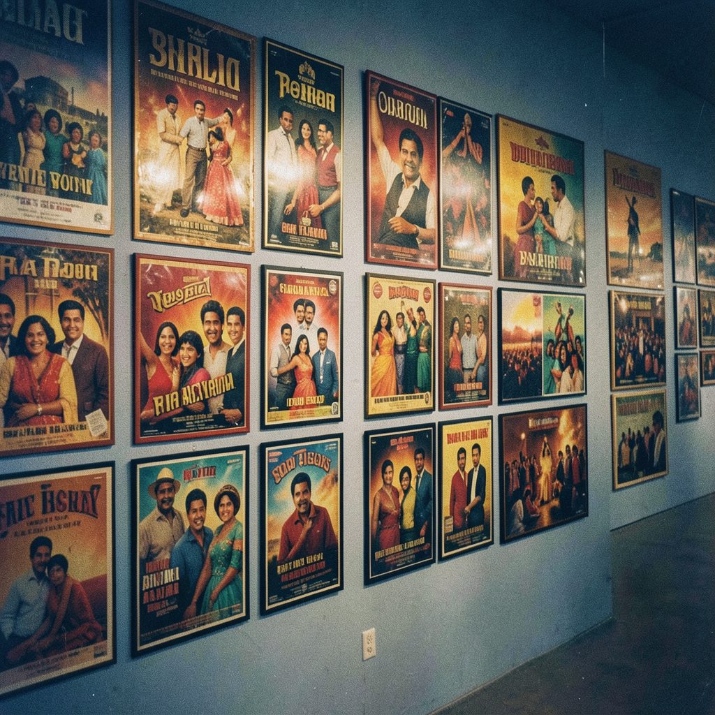
In the early decades of Hindi cinema, posters were created by artists who translated actors, scenes, and dramatic ideas onto large sheets of paper. These painters often worked from photographs, publicity stills, or verbal descriptions. Their goal was recognisable glamour, yet the final artwork could be far more expressive than a literal portrait.
Hand-painted cinema posters used bold outlines, exaggerated facial expressions, vivid reds, deep blues, and golden highlights. Heroes appeared larger than life, heroines were presented with carefully styled beauty, and villains were given sharp features or threatening shadows. Since printing limitations made fine detail difficult, strong silhouettes and high-contrast colours helped a design attract attention from a busy street.
The painter’s interpretation also introduced an element of fantasy. A performer could look more heroic, youthful, mysterious, or glamorous than in the film. This artistic freedom gave classic Hindi film posters a distinctive personality and helped create an emotional promise before audiences entered the theatre.
Stars, studios, and visual codes
As Bollywood expanded, the poster became closely connected with the star system. A familiar face could dominate the composition, while the title, producer, director, and supporting cast occupied smaller areas. For major releases, several poster versions might be produced: a romantic design, an action-focused design, a character portrait, or a crowded ensemble image.
Certain visual codes became instantly readable. Red suggested passion, revenge, or melodrama; yellow and orange conveyed celebration and energy; black often signalled crime, suspense, or tragedy. Decorative lettering reinforced genre, from flowing scripts for family romances to heavy block fonts for action films. These choices allowed viewers to identify the mood of a release from a distance.
Posters also helped preserve the era’s fashion. Costumes, hairstyles, jewellery, sunglasses, and makeup frequently became as memorable as the title itself. For fans and collectors, old lobby cards, illustrated sheets, and film hoardings now offer a vivid record of how Hindi cinema represented masculinity, femininity, romance, and social aspiration.
Printing technology changes the frame
Offset printing and improved colour reproduction gradually changed the relationship between artwork and photography. Designers could combine painted backgrounds with photographic portraits, creating hybrid posters that retained the drama of illustration while offering greater likeness. Large-format printing made roadside billboards more detailed and visually demanding.
By the 1980s and 1990s, photographic key art had become increasingly common. Multiple images could be arranged into a collage, with the leading star positioned at the centre and smaller character portraits surrounding the main title. Smoke, flames, explosions, rain, and glowing skies were added to amplify genre signals, even when these elements had little connection to a specific scene.
The arrival of desktop publishing introduced faster revisions and more controlled typography. Marketing teams could test several layouts, change release information, and adapt one campaign for newspapers, theatre displays, cassette covers, and magazine advertisements. Poster production became more collaborative, involving photographers, retouchers, art directors, copywriters, and publicity departments.
| Era | Main visual method | Common strengths | Typical limitations |
|---|---|---|---|
| Early studio period | Hand-painted illustration | Emotional faces, bold colour, memorable characterisation | Limited reproduction detail |
| Hybrid print era | Painted backgrounds with photographs | Dramatic compositions and recognisable stars | Uneven visual consistency |
| Photographic collage era | Retouched portraits and layered layouts | Strong celebrity appeal and genre emphasis | Crowded compositions |
| Digital campaign era | Compositing, 3D elements, and image manipulation | Fast adaptation across formats and platforms | Risk of generic or over-polished imagery |
Digital tools reshape the poster
Digital art has made the modern Bollywood poster more flexible than ever. A designer can photograph actors separately, build an entirely new environment, adjust the lighting, create multiple title treatments, and prepare versions for cinema screens, mobile feeds, video thumbnails, and outdoor displays. The same campaign can now exist as a still image, animated poster, short teaser, or interactive social media asset.
Photo manipulation has also expanded the visual vocabulary of Hindi film marketing. Designers use digital painting, 3D modelling, compositing, colour grading, and artificial environments to suggest worlds that would be expensive or impossible to photograph. Fantasy films, action spectacles, period dramas, and science-fiction projects benefit especially from this approach.
At its best, digital poster design creates a clear visual identity. A controlled palette, strong central image, and memorable symbol can make a film recognisable across platforms. At its weakest, excessive retouching produces identical faces, weightless bodies, crowded backgrounds, and images that promise a different film from the one audiences eventually see.
From printed hoardings to shareable artwork
The biggest change is the poster’s distribution. A painted hoarding once depended on location and foot traffic. A digital poster can reach millions within minutes, be reposted by fan communities, appear in entertainment news coverage, and become a wallpaper or profile image. This has encouraged studios to design for immediate recognition on small screens.
The rise of social media has made launch timing part of the artwork’s impact. First-look posters, character reveals, motion posters, title announcements, and anniversary designs now arrive as a sequence rather than a single campaign image. Fans discuss typography, costumes, hidden clues, and visual references before the trailer is released.
Music marketing has followed a similar path. A song poster must communicate mood, performers, and release information while remaining attractive enough to circulate independently. The changing relationship between songs and film promotion can be seen in discussions of Bollywood music trends, where sound, star imagery, and digital promotion increasingly work as a connected package.
Design choices that still matter
Technology does not automatically create an effective poster. The strongest designs usually begin with a simple idea: a striking pose, a symbolic object, an unusual colour relationship, or a visual conflict between characters. When every actor, effect, and credit receives equal emphasis, the eye has no clear place to settle.
Typography remains equally important. A title should be readable in a thumbnail, distinctive on a billboard, and appropriate to the film’s tone. Custom lettering can make a poster feel rooted in a particular period or region, while restrained modern fonts may communicate realism and prestige. Poor spacing or excessive font effects can weaken an otherwise attractive image.
For fans studying film artwork, these details reveal how marketing frames a story. Compare the poster with the trailer and finished film: does it promise intimacy, spectacle, comedy, or social drama? Does the visual identity belong to the characters, the star, or the brand of the studio? Such questions make poster collecting and analysis more rewarding.
Ways to read a Bollywood poster
A useful poster deserves attention beyond its celebrity faces. These practical details can help viewers understand the choices behind a campaign:
- Identify the dominant colour and consider the emotion or genre it signals.
- Notice which character receives the largest space and what that says about star hierarchy.
- Examine the title lettering, credit placement, and balance between image and text.
- Look for recurring symbols, costumes, locations, or objects that connect to the film’s theme.
- Compare the first-look design with later posters to see how the marketing message changes.
The evolution from hand-painted artwork to digital illustration has expanded creative possibilities without removing the basic purpose of a poster: create curiosity in a single glance. Brushwork has given way to pixels, yet composition, colour, personality, and emotional suggestion remain central.
For Wassupbollywood readers, this history adds another layer to following new releases, celebrity updates, trailers, and film reviews. The next time a Hindi film poster appears on a screen, pause over its design choices. Share the artwork, revisit classic examples, and follow how each campaign turns a movie into an image before the opening scene begins.